

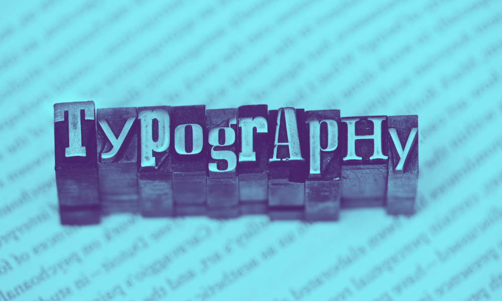
The Importance of Typography in Web Design
Posted on 17th March 2023
Typography – the art of arranging, styling and structuring text – is an essential part of web design. It has the power to evoke emotion and bring text to life. Typography isn’t just about choosing or creating a beautiful font style; there are many other factors to consider, such as the height and weight of a typeface, letter spacing and rotation, and line length. In this blog, discover some of the benefits strong typography can bring to your website.
Why is typography important?
Think of typography as a tool for communicating with your website visitors. Done well, it’ll convey your messaging legibly, establish and reinforce your brand identity and get visitors to convert.
Specifically, good website typography can:
1. Provide a clear visual hierarchy
Visual hierarchy on a website relates to the way design elements are arranged. Visually appealing typography creates a good graphic balance and helps guide users to easily find the information they need on a webpage. Typography can define important content and draw attention to unique selling points and call-to-actions, encouraging visitors to take the desired action.
2. Increase engagement
Attractive typography is visually stimulating and can capture and hold visitors’ attention from the first line to the last. Presenting your content in the best way possible could mean people stay on your website long enough to become customers.
3. Contribute to brand identity
Typography helps convey the values and tone of your brand. It can create deeper connections with visitors and influence perceptions about your business. And it can become instantly recognisable. Take Coca-Cola, for instance. This global company uses a custom font called Spencerian Script (heavily copyrighted) for its logotype and is based on a type of cursive handwriting favoured in the 19th-century United States. The design is timeless and unique, perfectly complementing Coca-Cola’s brand identity.
4. Enhance readability and accessibility
Typography includes features like letter shape, size, spacing and line length, all of which can influence legibility and reading fluency. So, it’s an important consideration when building an accessible website (one that works for all users, including those who are visually impaired). Fonts that work best on screen have open letterforms – examples include Open Sans and Montserrat.
Typography shouldn’t be overlooked in web design
There are thousands of licensable and free fonts to choose from, which talented graphic designers have already created. Knowing which ones are right for your brand identity and tone of voice can be tricky as there are so many variables to consider.
With an it’seeze website, our design team will select the best typography combinations that suit your branding, are aesthetically pleasing and – importantly – are legible and suitable for accessibility.
Share this post: