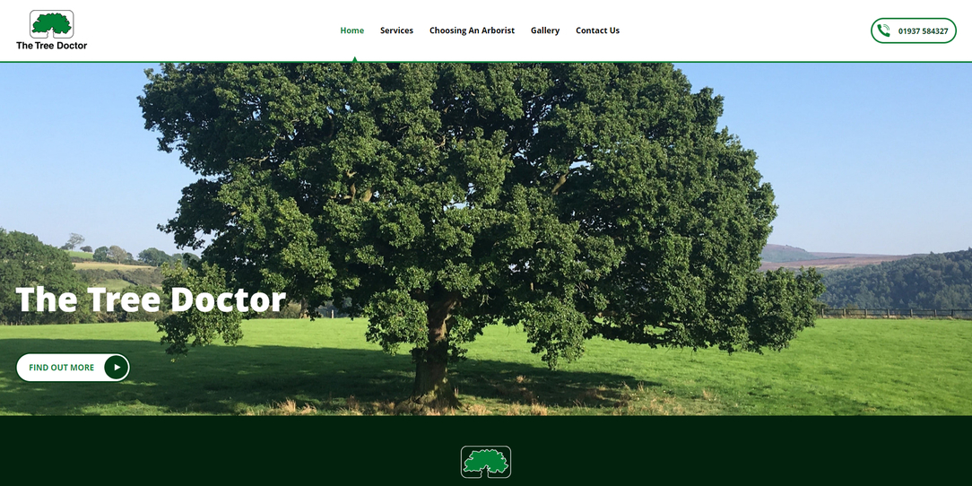
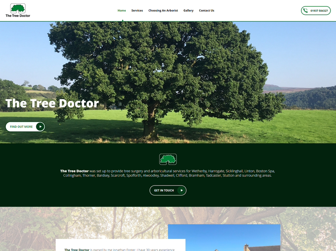
York Web Design Portfolio. 

We can give your business the website it deserves with a fresh new design 

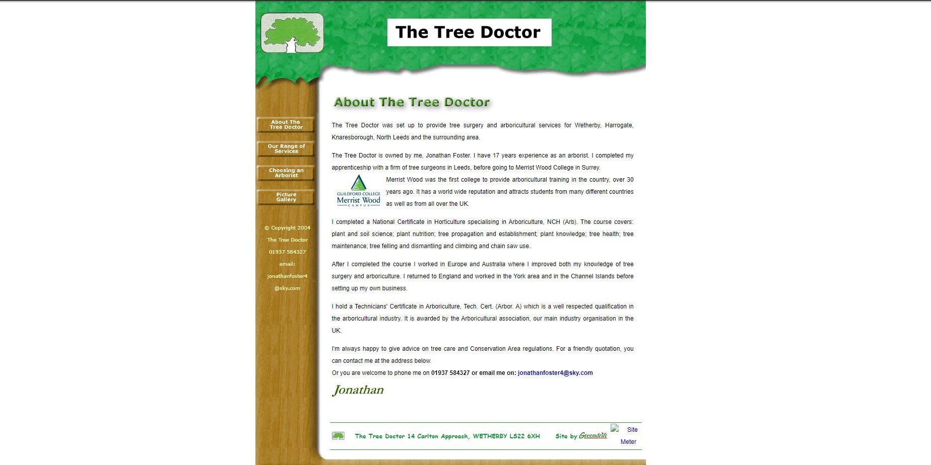
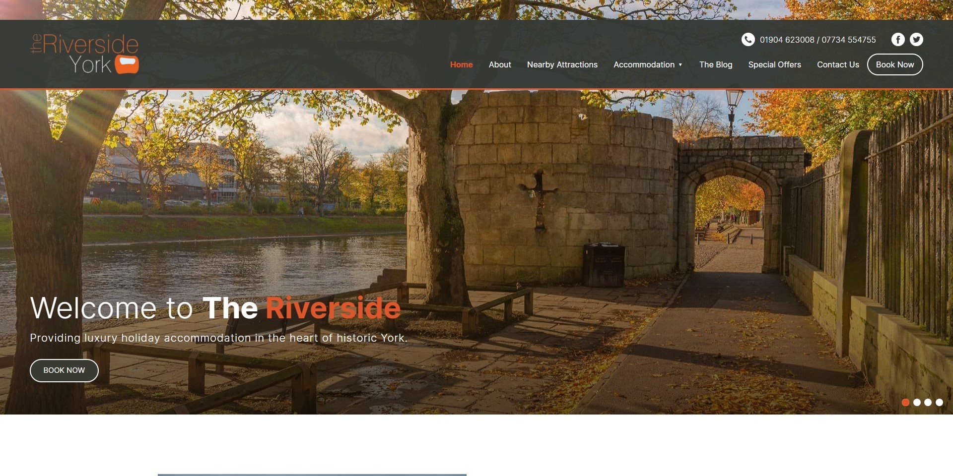
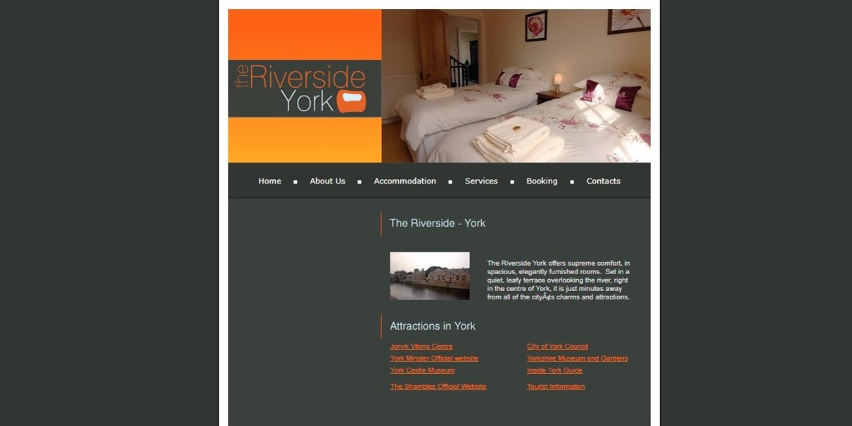
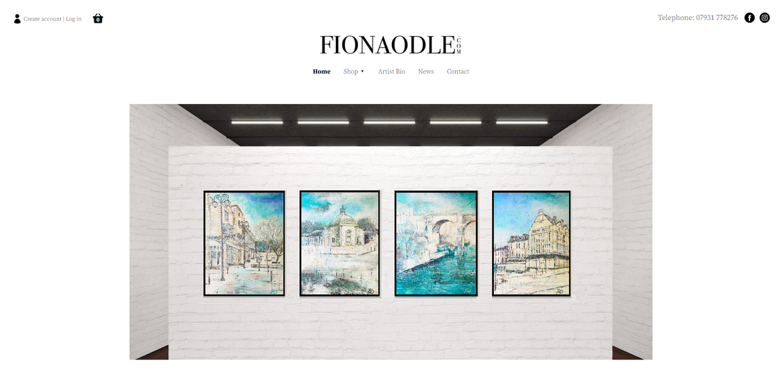
 Don't let an old website hold your business back 

It’s essential to your online success that your website looks professional, attracts the right visitors, and wins you more business. At it'seeze York, we take outdated, underperforming, and non-responsive sites and transform them into beautifully designed and results-focused websites that help our clients grow. 
The new Artus website, designed by it'seeze, shown on desktop
The before Artus Digital Marketing website, displayed on desktop
BEFORE 
The before Artus Digital Marketing website, displayed on desktop
AFTER 
The new Artus website, designed by it'seeze, shown on desktop
As a young and dynamic company, that has grown steadily in the last 12 months, Artus had outgrown their old website. It no longer reflected the range of content writing, reputation management, social media management and consultancy services that they are expert in. 
 
The new website provides a more professional, engaging and secure online presence. As wordsmiths Artus can now blog on their own website, add video and easily keep it fresh and up to date themselves. The new website really showcases Artus and has helped them generate new business. 
 
The end result was a modern 5-page Plus website from our it'seeze web design packages, showcasing the company's main three services, with well-placed and prominent call to actions across every page. 
 
The client is very happy with their new website and as a result they have noticed an improvement in organic enquiries. 
ARTUS DIGITAL 
 
As a young and dynamic company, that has grown steadily in the last 12 months, Artus had outgrown their old website. It no longer reflected the range of content writing, reputation management, social media management and consultancy services that they are expert in. 
 
The new website provides a more professional, engaging and secure online presence. As wordsmiths Artus can now blog on their own website, add video and easily keep it fresh and up to date themselves. The new website really showcases Artus and has helped them generate new business. 
NORTHERN SIGNS 
 
Northern Signs are in an industry where visuals are paramount, being experts in vehicle graphics, vehicle wraps and signage. The old website used a template builder and had been created by Gary the owner. It looked dated and didn't accurately reflect the services offered. Neither did it do justice to the high standard of work that Gary provides. He felt that the website needed to help him take his business to the next level. It was very generic and blocky and people were unable to scroll through any pictures. The new website is heavily focussed on showcasing the images Gary provided and has helped to attract more enquiries and business. The new, professionally designed, bespoke website creates a great first impression and impressively showcases Northern Signs services. 
The new Northern Signs, designed by it'seeze, website shown on desktop
The previous Northern Signs property, designed by it'seeze, website shown on desktop
BEFORE 
The previous Northern Signs property, designed by it'seeze, website shown on desktop
AFTER 
The new Northern Signs, designed by it'seeze, website shown on desktop
Northern Signs are in an industry where visuals are paramount, being experts in vehicle graphics, vehicle wraps and signage. The old website used a template builder and had been created by Gary the owner. It looked dated and didn't accurately reflect the services offered. Neither did it do justice to the high standard of work that Gary provides. He felt that the website needed to help him take his business to the next level. It was very generic and blocky and people were unable to scroll through any pictures. The new website is heavily focussed on showcasing the images Gary provided and has helped to attract more enquiries and business. The new, professionally designed, bespoke website creates a great first impression and impressively showcases Northern Signs services. 
HANSON & FOSTER 
 
A slick and modern new look helps to bring this engineering company’s website right up to date. 
 
Gone is the rigid, templated style of the previous site, with its block colours and outdated graphics. Instead, the redesign has resulted in a clean, modern palette and new branding, with professional photography for greater visual appeal. 
 
The result is a simple but effective website befitting a professional business. 
The new Hanson Foster Engineering, designed it'seeze, website shown on desktop
The previous Hanson Foster Engineering, designed it'seeze, website shown on desktop
BEFORE 
The previous Hanson Foster Engineering, designed it'seeze, website shown on desktop
AFTER 
The new Hanson Foster Engineering, designed it'seeze, website shown on desktop
A slick and modern new look helps to bring this engineering company’s website right up to date. 
 
Gone is the rigid, templated style of the previous site, with its block colours and outdated graphics. Instead, the redesign has resulted in a clean, modern palette and new branding, with professional photography for greater visual appeal. 
 
The result is a simple but effective website befitting a professional business. 
MEDASIL 
 
Medasil operate in the medical supplies industry and need to appeal to a very specific target market - hospital procurement specialists, Dr’s, surgeons and theatre sisters. Their old website was dated and did not showcase the products they have to sell to their target market. It was difficult to navigate, had repeated content and no real calls to action. In fact the client "disliked everything" about their old website, other than the branding colour scheme, so we had more or less a clean slate to start from. The new website provides a more uplifting, up to date and visual online presence, that is clear and easy to navigate for people. Although the website does not have a "shop", the products can be easily found with clear calls to action on “how to buy”. 
The new Medasil, designed by it'seeze, website shown on desktop
The previous Medasil, designed by it'seeze, website shown on desktop
BEFORE 
The previous Medasil, designed by it'seeze, website shown on desktop
AFTER 
The new Medasil, designed by it'seeze, website shown on desktop
Medasil operate in the medical supplies industry and need to appeal to a very specific target market - hospital procurement specialists, Dr’s, surgeons and theatre sisters. Their old website was dated and did not showcase the products they have to sell to their target market. It was difficult to navigate, had repeated content and no real calls to action. In fact the client "disliked everything" about their old website, other than the branding colour scheme, so we had more or less a clean slate to start from. The new website provides a more uplifting, up to date and visual online presence, that is clear and easy to navigate for people. Although the website does not have a "shop", the products can be easily found with clear calls to action on “how to buy”. 
The new Tree Doctor website, designed by it'seeze, shown on desktop
The previous Tree Doctor website shown on desktop
BEFORE 
The previous Tree Doctor website shown on desktop
AFTER 
The new Tree Doctor website, designed by it'seeze, shown on desktop
The tree doctors old website was over 18 years old and it showed. The current web designer was long since retired and the website looked like a postage stamp on mobile phones. Jonathan the owner knew that a new website was long overdue and we were able to take his images and use these to bring alive the business and the tree surgery services that he offers. The new, modern, visual website has taken The Tree Doctor's online presence to a whole new level and has helped increase enquiries and more of the type of work that The Tree Doctor prefers. 
THE TREE DOCTOR 
 
The tree doctors old website was over 18 years old and it showed. The current web designer was long since retired and the website looked like a postage stamp on mobile phones. Jonathan the owner knew that a new website was long overdue and we were able to take his images and use these to bring alive the business and the tree surgery services that he offers. The new, modern, visual website has taken The Tree Doctor's online presence to a whole new level and has helped increase enquiries and more of the type of work that The Tree Doctor prefers. 
 
 
THE RIVERSIDE YORK 
 
The Riverside York had an existing website that they liked the look of - but the website was over 10 years old and no longer worked as it should – it was confusing to navigate, hid the key content away, with certain content not loading, images loading very slowly and with insecure browsing. As a result it was long overdue a change. 
The new it'seeze website transformed the browsing experience for people wanting to find out more and book. It includes clearer calls to action, updated imagery and copy and overall a much improved customer experience, leading to more bookings and happy customers. 
The new Riverside York, designed by it'seeze, website shown on desktop
The previous Riverside York site, designed by it'seeze, website shown on desktop
BEFORE 
The previous Riverside York site, designed by it'seeze, website shown on desktop
AFTER 
The new Riverside York, designed by it'seeze, website shown on desktop
The Riverside York had an existing website that they liked the look of - but the website was over 10 years old and no longer worked as it should – it was confusing to navigate, hid the key content away, with certain content not loading, images loading very slowly and with insecure browsing. As a result it was long overdue a change. 
The new it'seeze website transformed the browsing experience for people wanting to find out more and book. It includes clearer calls to action, updated imagery and copy and overall a much improved customer experience, leading to more bookings and happy customers. 
CHAMELEON CREATIVE ARTS 
 
Fiona had built her own templated website, but was aware there was room for improvement. She was unable to sell her artwork through the website and when navigating from one page to another you couldn't tell you'd actually moved from one page to another. All in all the browsing experience meant people would be clicking away from her website without spending any time looking at the fabulous artwork. The new website, using a similar colour scheme, provides a simple, clear browsing experience that's all about the artwork – people can see it, what it costs and easily buy if they wish to do so. The new website provides Fiona with a professional online presence and crucially a new route to market. 
The new Chameleon Creative Arts, designed by it'seeze, website shown on desktop
The Fionaodle website, designed by it'seeze, website shown on desktop
BEFORE 
The previous Fionaodle website, designed by it'seeze, website shown on desktop
AFTER 
The new Chameleon Creative Arts, designed by it'seeze, website shown on desktop
Fiona had built her own templated website, but was aware there was room for improvement. She was unable to sell her artwork through the website and when navigating from one page to another you couldn't tell you'd actually moved from one page to another. All in all the browsing experience meant people would be clicking away from her website without spending any time looking at the fabulous artwork. The new website, using a similar colour scheme, provides a simple, clear browsing experience that's all about the artwork – people can see it, what it costs and easily buy if they wish to do so. The new website provides Fiona with a professional online presence and crucially a new route to market. 
Our site uses cookies. For more information, see our cookie policy. Accept cookies and close
Reject cookies Manage settings